Martine Johanna
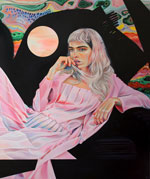
Fascinating work by Martine Johanna.
From Martine’s bio:
“Seemingly light hearted, it explores the duality between youthful naivety and anxiety-riddled adulthood. The often female figures, fierce but fragile, gazing distractedly into the beyond within their own ‘internal psychic landscape.’ The work is imbued with a mysterious narrative and sensation of knowing that each character in the work has a full and complex history that the viewer can never fully comprehend. The paintings have a signature prismatic palette, visually stimulating and playful while expressing an underlying sense of uncertainty and unrest.”
Martine on Instagram.
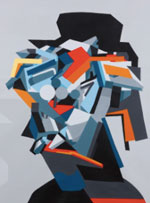
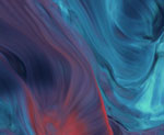
Fabio la Fauci
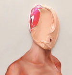
Fabio la Fauci smears thick layers of acrylic paint to create these fascinating faceless portraits.
From Fabio’s website:
“Fabio La Fauci’s work, often inspired by surrealism, abstract expressionism, and minimalism, and oscillating between abstract geometry and organic reality, escapes all attempts at artistic classification. His works’ intrinsic plastic ambiguity enables a transformation, the passage from one form to another form and from one meaning to another meaning. This process derives from the artist’s subconscious, from his most hidden fears and emotions and art becomes, in this perspective, a sort of catharsis.”
You can find Fabio on Instagram here.
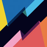
Nelio
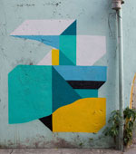
Street art and abstract murals by Nelio.
From streetartbio.com:
“Nelio is like Picasso let loose onto the street with a spray can and a sugar rush. His work blends abstract art, architecture, cubism, graphic design and – the spiritual mother of all street art – the graffiti mural. Continuing to stay true to street arts roots, Nelio uses the humble spray-can to build pieces made of cleanly cut symbols, geometric shapes, letters and sometimes facial features. Along with his other influence of ancient art, the raw shapes are like a mysterious ineffable language, communicating with you like a hieroglyphic or a piece of music.”
Check out Nelio in the studio in this short video.
Nelio on Instagram.
Kwang-ho Lee
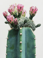
Gorgeous large-scale hyperrealistic paintings of cacti by Kwang-ho Lee.
From Lee’s profile on Johyun Gallery’s website:
“Lee Kwang-Ho, is a representative figure in realism paintings. He takes daily subject matters and takes the reproduction of their forms into a unique language of his own. Although realism seems like quite a laborious task and sometimes compulsive as well, through the pictorial depiction of Lee Kwang-Ho, we see the reconstructed reality fabricated by his intentions. Subjects that are expressed both vigorously and dramatically expose the desires of their subconscious, and also stimulates the tactility of those that behold them.”
Here’s Kwang-ho Lee on Artsy.
Jonathan Niclaus
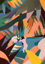
Illustration work by Jonathan Niclaus.
Niclaus discusses his technique in this It’s Nice That feature:
“I often start with pencil sketches so that my work is infused with a traditional aesthetic. I have moved away from perfect vector shapes, imperfect forms and ‘mistakes’, together with different textures, to help me conjure an artisanal feel in the final piece.”
And here’s Niclaus on the sources he draws from:
”“I spent hours flipping through Polish posters from the 60s or trawling through the work of Swiss graphic artists. Everything is a potential source – old Playboy ads, vinyl covers and movie posters can all bring the right vibes.”
Jonathan on Instagram.
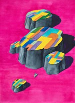
Sculptures by Jaime Pitarch
Whimsical sculptures by Jaime Pitarch.
From Jaime’s bio on Spencer Brownstone Gallery’s site:
“Jaime Pitarch creates sculptures, drawings, videos and installations often using humble everyday objects such as a guitar, chair, or household and consumer products. He employs inventive strategies of displacement, re-contextualization and visual punning to peel away at their routine uses and meanings to alter our relationship with such utilitarian items.”
More work from Jaime on Artsy.
Animated GIFs by Dave Whyte

Incredible GIF animations by Dave Whyte.
Dave Whyte on Instagram and Twitter.
From a Colossal feature on Whyte:
“The Dublin-based PhD student is currently studying the physics of foam and tells us his first geometric gifs riffed on computational modules he was exploring while in undergrad. As interest in the work grows Whyte is focusing more on his artistic side, pushing the boundaries of these small animations created with the Processing programming language. He’s now able to fully envision each animation before coding it, making tweaks to color, timing, and measurements along the way.”
Andy Gilmore
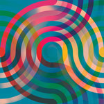
We’re loving this new work by Andy Gilmore.
Andy Gilmore was featured in LAB 04.
You can find Andy on Instagram here.
Ghostly International has released a short video of Andy Gilmore’s creative process.
Gilmore on patterns in this Verge feature:
“When I see patterns in nature like petals or leaves or flowers I always count them, and I’m very aware of those relationships and the numbers that exist in nature. I think about that a lot and I do bring those numbers into my work.”
Rob Sato
Some fantastic work by Rob Sato on Instagram.
Check out this Hi Fructose visit to Rob’s studio on YouTube.
You can also find more from Rob Sato on Giant Robot.
From a Redefine feature on Sato:
“Los Angeles-based artist Rob Sato is more than a painter of fantastical watercolor dreamscapes. Challenging his own magnificent talent as a masterful visual creator, Sato is also a prolific consumer of culture. Profoundly influenced by historical events, dynamic music, and piles of life-changing books, he is able to channel many diverse creative explorations into colorfully horrific and disarmingly beautiful works of art; his work is an intriguing amalgam of childhood fantasies and literary consequence, adeptly bridging the gap between fantasy and reality.”
Tobias Kroeger
LAB featured some of Tobias Kroeger’s work back in issue 15. Here’s some more recent work from Tobias.
You’ll also find Tobias on Instagram and Twitter.
To see Tobias in action, check out this short video on Vimeo: Work in Progress.
Larger street art pieces here.
From Kroeger’s site:
“Kroeger has catapulted the classical portrait—in which he often inserts quotes—into the digital world of ones and zeros. When speaking about his works, Kroeger talks about data fragments and machine elements, of heteronomy and life dreams that have little space under the conditions of mechanization and, therefore, get lost in standardized conditions.”
Stu Brown
Fantastic abstract paintings from Stu Brown. (via booooooom.com)
From Brown’s website:
“Stu Brown is an photographer, artist and designer from the UK now living and working in Melbourne, Australia. Stu is the resident visual and graphic designer at Citizen Theatre.”
Stu Brown on Instagram.
Olimpia Zagnoli
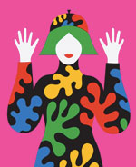
We’re enjoying these colorful, whimsical illustrations from Olimpia Zagnoli.
From Olimpia’s website:
“Olimpia is a creative female-type person born into an artistic family in Milano. She drives a Vespa and has large round glasses, but the main thing is that she can, and does, draw like an ambidextrous octopus. One with with prodigious skills, and a doppio espresso.”
“Although she will admit to being influenced by Bruno Munari, Paul Rand and the other usual suspects, she creates super fresh shapely shapes, completely new voluptuous forms, in her own clean palette of brights and darks, flat as a pancake, baby.”
Habitat
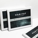
Tom Hegen, who LAB featured in LAB 16, has a new book out: Habitat.
Here’s a link to the book project on Kickstarter.
From Hegen’s Kickstarter page:
“The photo book HABITAT explores the relationship between man and nature by aerial photography. It focuses on landscapes that have been transformed by human intervention. The project invites viewers to discover our planet from a new perspective, to comprehend the dimensions of human interventions on our Earth’s surface, and, ultimately, to assume responsibility.”
Gorgeous motion work by Davy Evans
Gorgeous work by Davy Evans in this short video (9 Ambient).
From Davy Evans’s website:
“Davy Evans is an award winning multidisciplinary artist and designer based in Brighton. With a background in graphic design, Evans fuses analogue and digital techniques to create ethereal abstract imagery. He often uses experimental photographic methods, combined with light and liquid to replicate colour, form, and distortions, inspired by natural phenomena.”
Much more from Davy Evans over on Vimeo.